Whether consciously or instinctively, we often rely on data in our everyday decisions. Before making a purchase, many of us check product reviews, compare prices, or read about others’ experiences. All of this information influences our choices. Even those who decide primarily based on emotion must occasionally rely on numbers, especially when facing major life milestones, such as applying for a home loan. In short, data influences us constantly, and the same holds true in the field of UI/UX.
Data-driven decision-making is no longer a privilege reserved for large corporations; it is vital for small businesses as well. An SME often generates revenue from a smaller customer base, meaning the loss of even a single customer is felt deeply. The success of a business website largely depends on how effectively it optimizes the user experience and conversion processes based on real-world data. Let’s explore how data-driven design facilitates this.
What is Data-Driven Design?
The essence of data-driven design is that decisions made during website design and development are based on objective, measurable data rather than hunches, personal preferences, or the common (and often counterproductive) “I like it better” mentality. In practice, this means we constantly—or at least periodically—monitor and analyze user behavior.
- Quantitative data reveals what is happening on your site. This includes metrics such as visitor count, click-through rates, time spent on site, and conversion rates. This data is objective and quantifiable, making it ideal for identifying trends or specific pain points.
- Qualitative data, on the other hand, explains the why and the how. This includes user feedback, interviews, observations, and session recordings. This information provides a deeper understanding of the motivations behind user behavior.
It is important to emphasize that both types of data are necessary to provide a complete picture. Qualitative insights are just as valuable as statistical metrics. A truly effective data-driven model leverages both to inform better decisions and enhance the user experience.
The Importance of Measurement
You can only make informed decisions when you have sufficient data. Most companies eventually reach the point where they have Google Analytics integrated—which is a start. However, in many cases, no one actually analyzes the data, leaving the business without actionable information.
A wide range of measurement tools and analytical software is available, most operating on a subscription model. To use them effectively, a theoretical background is required to process and interpret the results correctly.
In the Hungarian market, Small and Medium Enterprises (SMEs) often fail to analyze even the basic data provided by free tools. One primary reason is that they are unaware that data analysis—such as a UX audit—is a specialized service in itself that can uncover hidden problems and growth opportunities.
Why is a Data-Driven Approach Essential?
Concrete data shows that 60% of visitors abandon an online purchase due to a poor website experience. This means that if your website is difficult to navigate or frustrating to use, more than half of your potential buyers will leave.
Statistics also demonstrate that data-driven changes improve performance approximately 30% of the time, while random changes only succeed in about 10% of cases. This illustrates the high risk of designing “blindly.” In contrast, data-driven design allows us to identify exactly where bottlenecks exist and where there is room for improvement.
Key Data Sources and Metrics
To improve your website effectively, you must first reliably measure its performance. Here are some critical data sources:
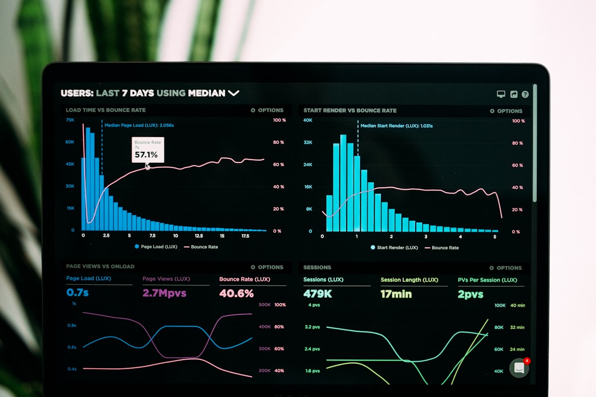
- Web Analytics and Heat Maps: Tools like Google Analytics provide a detailed picture of visitor behavior: their origin, which pages they view, and how long they stay. You can see which subpages are popular and where bounce rates spike. Additionally, heat map tools like Hotjar or Crazy Egg visually demonstrate where users click and how far they scroll, highlighting which elements attract attention and which are ignored.
- User Testing and A/B Testing: A usability test with just a few real users can uncover issues that aren’t apparent from numbers alone. A/B testing allows you to compare two versions of a page; one group sees Version A, the other sees Version B, and you can objectively determine which performs better.
- Session Recordings and Feedback: Tools like Hotjar record video sessions of users navigating the site. These recordings provide an accurate look at mouse movements, clicks, and scrolling—even identifying the exact moment a user gives up. This allows designers to identify “friction points,” such as elements that look clickable but aren’t. Collecting direct feedback via questionnaires is also invaluable, as users often reveal problems that statistics alone cannot capture.
- Conversion Rates and Cart Abandonment: A key metric for any business is the conversion rate—the percentage of visitors who complete a desired action (purchase, registration, etc.). A low rate indicates that users are getting stuck somewhere in the funnel. Similarly, the cart abandonment rate in e-commerce reveals how many people add products but fail to finalize the purchase. High abandonment suggests the payment process is too complex or unexpected costs were revealed late in the journey.
Data-Driven Redesign
Every website eventually requires a redesign, often because its visual style has become outdated. However, a redesign is not just an aesthetic update; it is an opportunity to improve the user experience based on historical data.
When planning a redesign, start by reviewing the performance of your current site. Which pages are popular? Where do visitors drop off? If you find that many people view product pages but leave without buying, the content or the call-to-action (CTA) may not be compelling enough.
Data serves as a compass. If users struggle to find information, it must be placed more prominently in the new version. If they abandon a lead form, the new design should simplify it (fewer fields, clearer instructions). Without data, a redesign may look “nicer,” but the underlying functional problems will remain.
Examples of Data-Driven UX Development
- Simplifying Navigation: If analytics show visitors struggle to find info, or if the internal search engine is heavily used, the menu structure is likely unclear. The goal is to allow users to find what they need in as few clicks as possible.
- Optimizing CTA Buttons: The placement and appearance of “Buy” or “Request a Quote” buttons significantly impact conversion. Data might reveal a button is “below the fold” (too low) or blends too much into the background. A striking color or clearer text can immediately increase clicks.
- Shortening Forms: If a form has a high abandonment rate, it is likely too long or asks for unnecessary information. By removing non-essential fields, you reduce the effort required, leading to higher completion rates.
- Content and SEO Optimization: Data helps you decide what content to produce. If visitors are frequently searching for a specific question, creating dedicated content on that topic will increase satisfaction and keep users on your site longer, which also improves search engine rankings.
Continuous Optimization vs. Massive Overhauls
A core principle of data-driven design is continuous optimization. Many businesses wait years to change anything, then try to fix everything at once with a total redesign. In contrast, successful companies (like Amazon) improve in small increments.
Market leaders rarely change their entire interface overnight; they refine it through constant A/B testing. This minimizes risk. If you change fifty things at once and your metrics drop, it’s impossible to know which change caused the problem. With gradual updates, you see immediate results.
When the Client Disagrees: “…But We Like It Better”
Whether you address this directly or keep it to yourself depends on your communication style and the nature of the collaboration. However, the point remains: a subjective opinion is irrelevant to a strategic business decision.
That said, even if a company makes a poor decision, they can still be a valuable client. We are not responsible for their business; it is their money and their risk. As a service provider, you offer professional advice. If they choose not to take it, there is no point in an endless argument. It is rare for a provider and a client to stay perfectly aligned for years; if you feel you have outgrown the partnership’s strategic level, it may be time to move on.
Summary
The goal of data-driven design is to ensure your website is not just visually appealing, but commercially effective. While analyzing data requires an investment of time, it pays off through higher conversion rates and satisfied customers.
A data-driven approach doesn’t replace creativity; it informs it. It’s about using feedback and measured results to determine the best path forward, ensuring the final product is both beautiful and successful.