In the world of digital products, a unified appearance and consistency are fundamental. As technology evolves, so does the demand for comprehensive design guidelines that govern not only visual aesthetics but also the development processes. This is achieved through Design Systems and Style Guides, which collect guidelines and rules for using design elements and styles.
Let’s take a detailed look at how these tools contribute to the creation of professional digital products.
What is a Design System and what is a Style Guide?
A website or application’s Design System and Style Guide are documents or collections containing the rules for design elements and styles. Their goal is to provide a unified and coordinated appearance for users, regardless of which part of the website they are viewing.
It is important to understand that a Design System and a Style Guide are not the same:
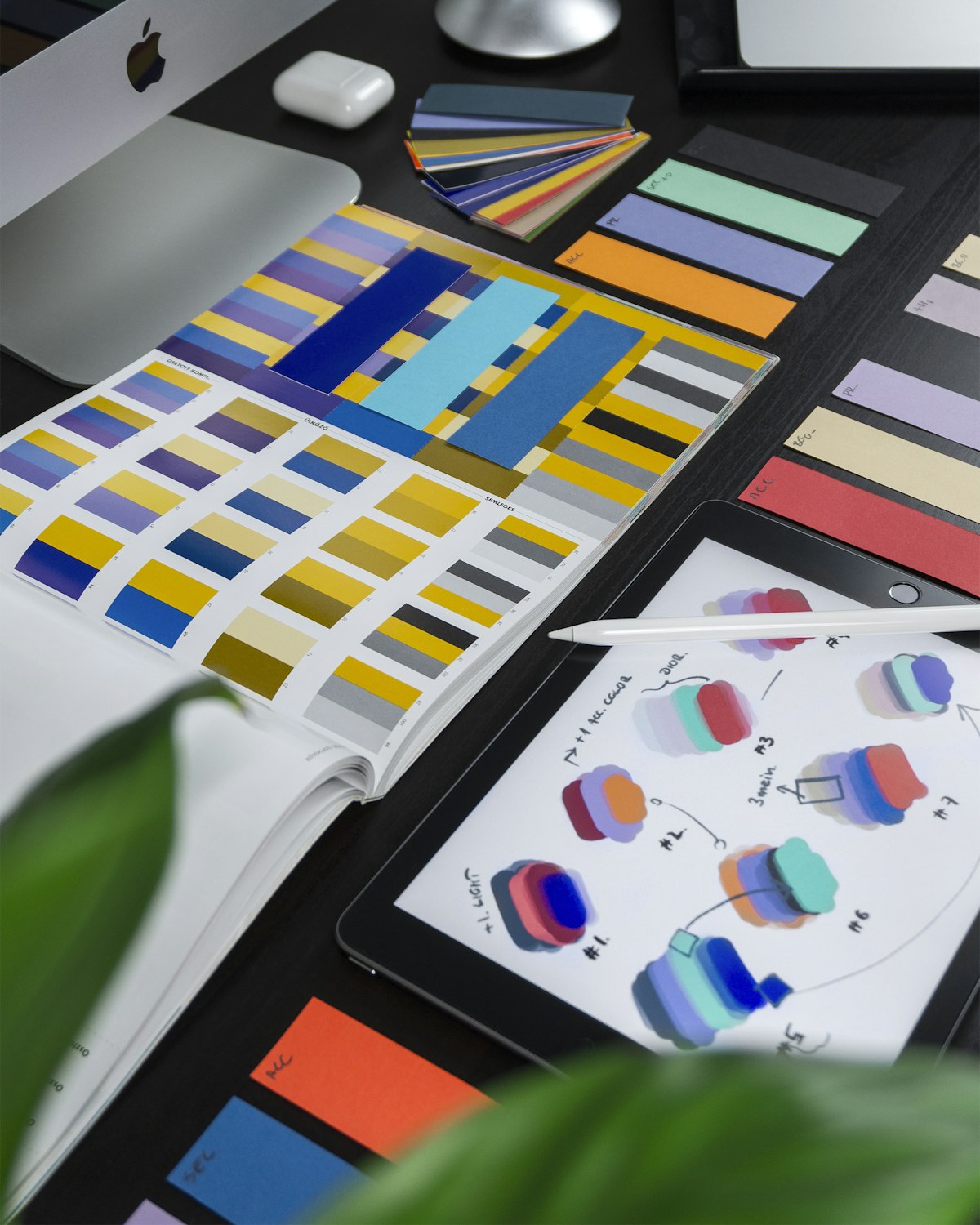
- Style Guide: Primarily focuses on visual appearance and aesthetic guidelines, such as colors, typography, icons, and other graphic elements. It is less detailed than a Design System, prioritizing graphic elements over functionality or development processes.
- Design System: A much more comprehensive framework. It includes every guideline, tool, template, and component necessary for designing and developing digital products. It contains UI components (buttons, forms, icons) along with their usage rules and variations. It applies a systematic approach, ensuring consistency across the entire website. The Design System actually incorporates the elements of a Style Guide but provides a much broader toolkit.
Comparing Objectives and Focus
| Feature | Style Guide | Design System |
| Primary Goal | Guidance: Provides aesthetic guidance on the brand’s visual and stylistic aspects. | Comprehensive Framework: For design and development; ensures consistency. |
| Complexity | Simple: Focuses on logos, palettes, and typography. | Complex: Includes design principles, UI components, and state variations. |
| Target Audience | Designers and marketers (brand consistency). | Designers, developers, and product managers. |
| Focus | Visual appearance without technical details. | Practical implementation and UI component integration. |
Detailed Element Comparison
Visual Style (Included in both)
- Color Palette: Defined primary, secondary, and accent colors.
- Typography: Specific font families, sizes, and weights.
- Iconography: A set of icons and their specific usage rules.
- Imagery: Styles for photos and illustrations.
UI Components (Exclusive to/Detailed in Design Systems)
A professional Design System defines the behavior and look of every interactive element:
- Buttons: Different types (primary, secondary, ghost) and their states (normal, hover, active, disabled).
- Forms: Input fields, checkboxes, radio buttons, dropdown menus, and their validation states.
- Navigation: Menus, navigation bars, and breadcrumbs.
- Data Display: Formatting for tables, rows, columns, and information cards.
- Overlays: Appearance and behavior of modal windows and pop-ups.
- Interactive Elements: Tabs and Accordion elements (opening/closing logic).
Layout, Grid, and Interactions
- Grid Systems: Rules for the layout, spacing, and margins.
- Interactions: Motion guidelines, click patterns, hover effects, and focus states.
- Accessibility: Guidelines for WCAG compliance and language handling.
When to Choose a Design System Over a Style Guide?
For SME (Small-to-Medium Enterprise) clients, we usually provide a Style Guide because they are primarily interested in visual elements. A Design System is essential for larger-scale projects or agency work where developers must continue the designers’ work seamlessly.
However, a Design System is worth considering for smaller businesses if:
- The company is on a growth path.
- The website is being expanded with a webshop or complex features.
- The goal is to maintain a consistent brand identity across new functions.
Connecting the Design System to the Frontend
A Design System allows us to turn visual elements into code. Professional development does not start with the logo; it starts with defining Global Styles.
Atomic Development (From Atoms to Organisms)
Frontend development should start with the smallest units (Atoms) like buttons and labels. These atoms have predefined styles and behaviors. As we combine them, they form Molecules (e.g., a search bar) and eventually Organisms (e.g., a header). This standardization speeds up development and reduces errors.
Object-Oriented CSS (OOCSS)
The core idea is to write CSS that creates reusable “objects.” This methodology significantly reduces redundancy.
- Separation of Structure and Skin: We separate the layout (padding, alignment) from the design (colors, patterns).
- Reusable Classes: A
.cardclass should be usable in a product list, a blog feed, or a CTA section, even if its color changes.
The Evolution of CSS and Modern Selectors
Modern frontend technologies have adapted to the need for systematic design. New CSS selectors like :has() and :is() make it easier to define complex conditions without repeating code.
:has(): Allows targeting parent elements based on their children.:is(): Applies the same styles to multiple elements without repetition.
Code Examples from the System:
/* Reusable Buttons */
.btn {
    padding: 10px 20px;
    border: none;
    border-radius: 5px;
    cursor: pointer;
    font-size: 16px;
}
.btn-primary { background-color: #007bff; color: white; }
.btn-secondary { background-color: #6c757d; color: white; }

/* Reusable Cards (OOCSS) */
.card {
    border: 1px solid rgba(0, 0, 0, 0.1);
    border-radius: 4px;
    margin: 20px 0;
    padding: 20px;
    box-shadow: 0 2px 4px rgba(0, 0, 0, 0.1);
}
.card-white { background-color: #ffffff; color: #000; }
.card-black { background-color: #000000; color: #fff; }

/* Modern Logic */
div:has(.product) {
    background-color: lightblue;
    padding: 10px;
}
:is(ol, .list, ul) li {
    padding: 10px;
}